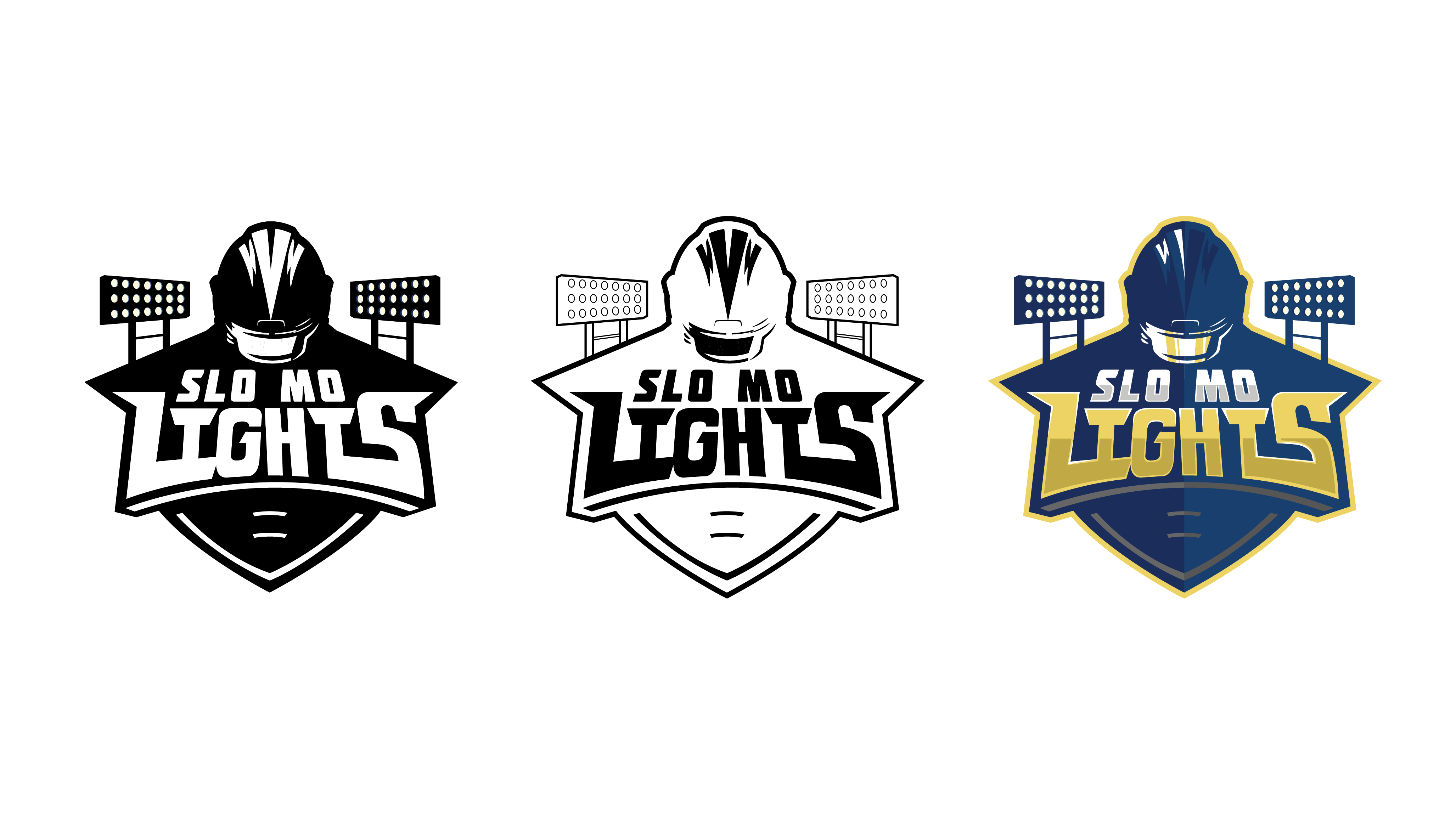
Sometimes a logo calls for custom typography in order to convey a certain message. I wanted the text to be edgy, bold, and to evoke a feeling of speed and acceleration.

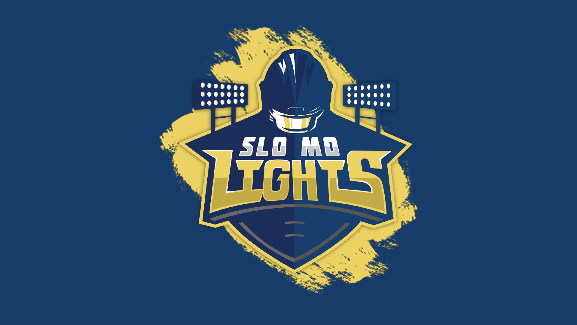
The logo for Slo Mo Lights captures the spirit of the series and uses easily recognizable elements of football, such as the helmet and lacing, to immediately establish its purpose as a football series.


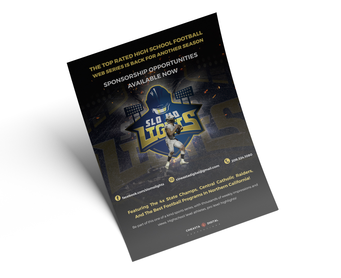
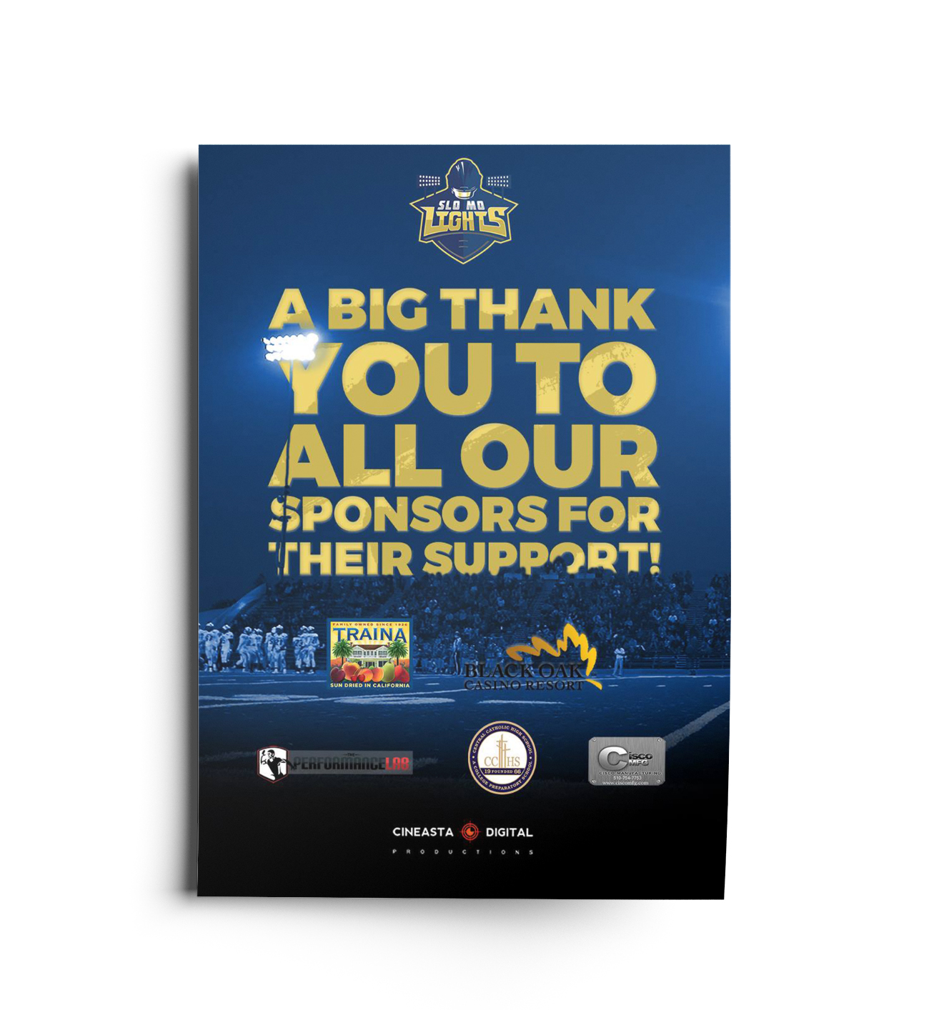
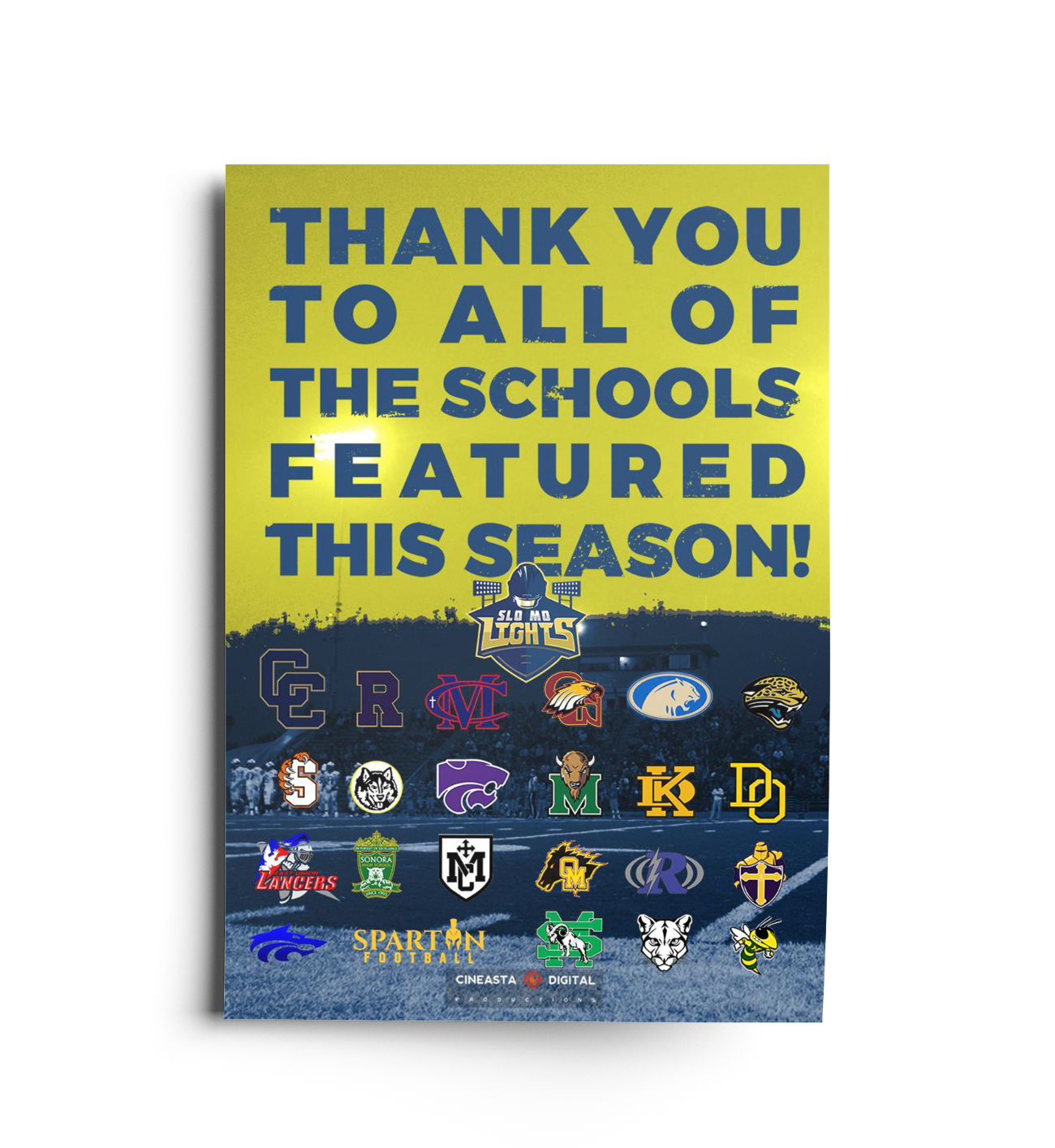
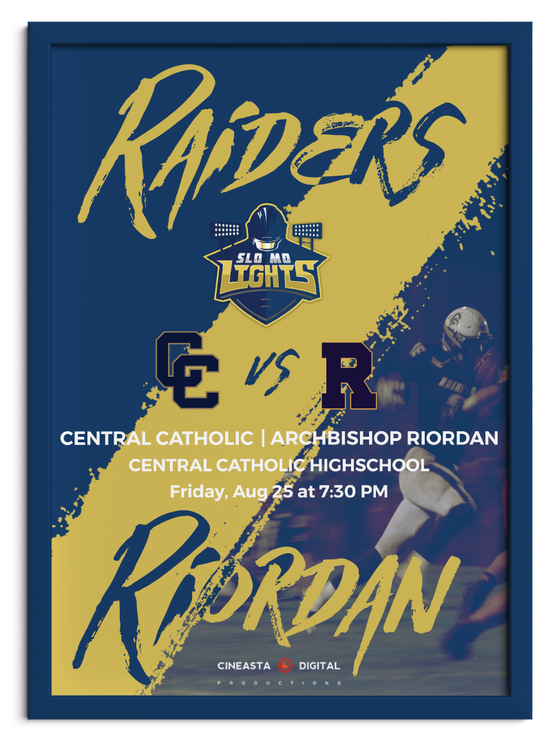
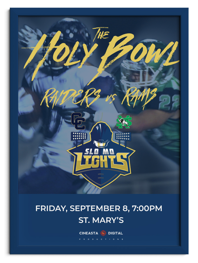
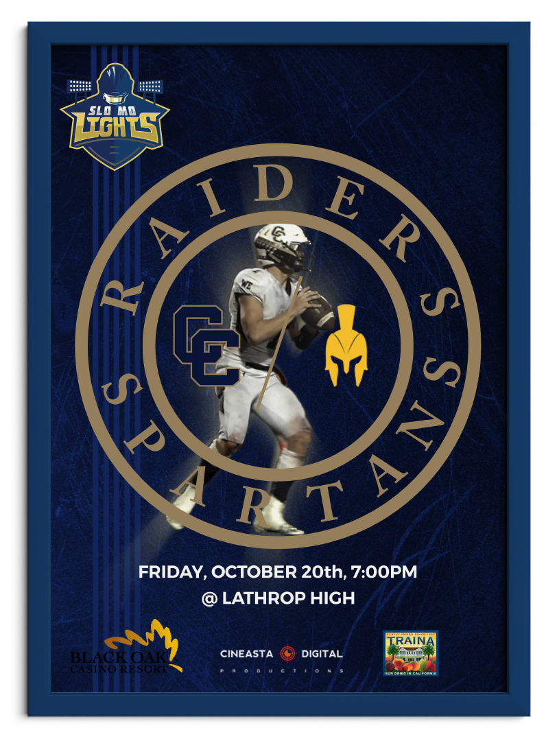
Sponsorships are the lifeblood of Slo Mo Lights. Having digital and printed flyers to send out was crucial in securing sponsors.
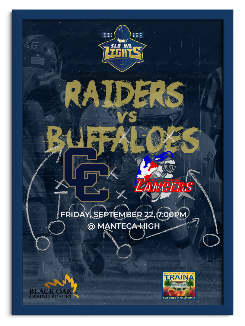
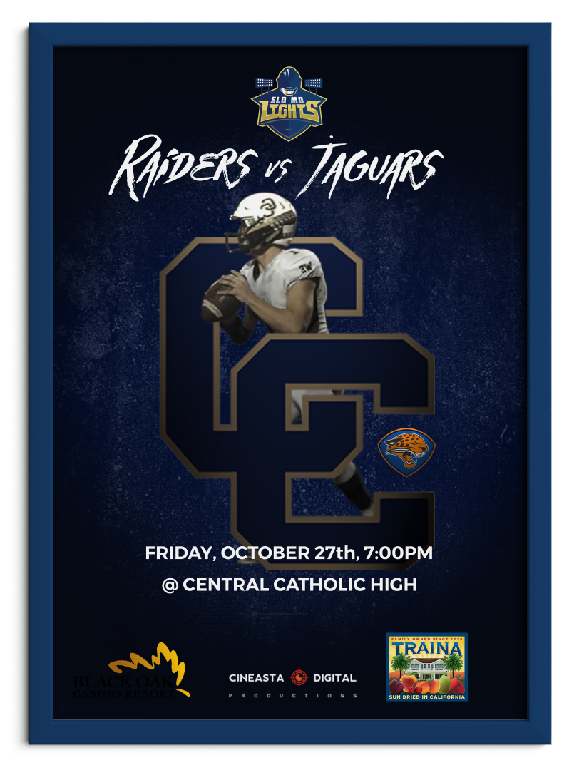
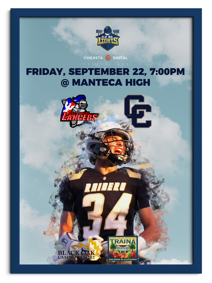
Getting the word out about the series was crucial to build a following and generate excitement. Digital posters of weekly games were a necessity for the growth of the series.
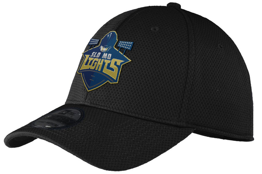
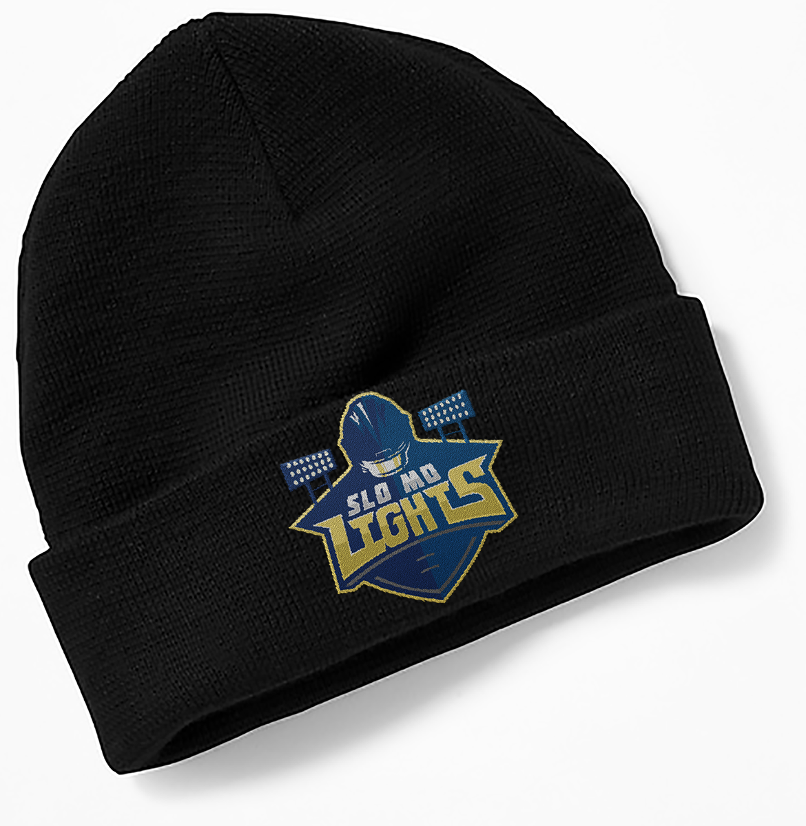
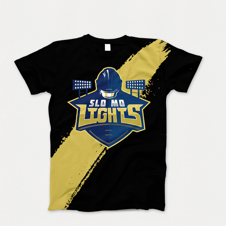
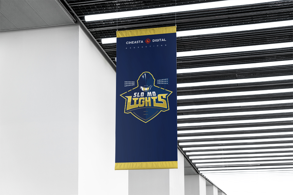
No football web-series would be complete without branded merch. The logo functions perfectly as the design on a hat, t-shirt, banner, you name it.